Chonky Bits: The Pixel Font That Transforms Your Retro Workflow
In the landscape of digital design, finding a typeface that balances nostalgia with modern functionality is often a struggle. Many retro fonts suffer from poor legibility at small sizes or look dated when applied to contemporary interfaces. Chonky Bits solves this specific problem by offering a pixel font that packs a punch without sacrificing usability. It is not merely a decorative element; it is a strategic asset for creatives, game developers, and marketers who need their text to shout "look at me" in an 8-bit style while maintaining professional polish.
This font was built for those who understand that visual hierarchy matters. Whether you are designing a user interface for a mobile game, creating thumbnails for a streaming channel, or crafting merchandise for a niche brand, the right typography can dictate how users interact with your content. Chonky Bits brings back the feel of old-school arcades but adds a modern edge that ensures compatibility with current screens and workflows. By integrating this tool into your creative process, you streamline the path from concept to final output.
Defining the Tool and Its Place in Your Design Stack
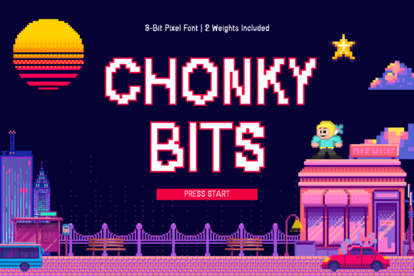
To use any tool effectively, you must first understand its core capabilities and where it fits within a broader ecosystem. Chonky Bits is characterized by thick, loud, and proud characters. This "chunky" aesthetic is deliberate, designed to mimic pixel-perfect arcade fonts from the golden gaming age while adhering to strict readability standards. Unlike many experimental pixel fonts that become illegible when scaled down, Chonky Bits features clean lines optimized for screen display.
The font comes with two distinct weights: Regular and Bold. This duality is crucial for workflow efficiency. The Regular weight provides a clean foundation suitable for game interfaces, body text in manuals, or standard UI elements where clarity is paramount. The Bold weight offers maximum impact, ideal for headlines, call-to-action buttons, or overlay graphics on social media. Having these two variations in a single package eliminates the need to search for complementary fonts or manually adjust kerning to create emphasis.
When planning a project, consider how this font interacts with other assets. If you are working with vector-based illustrations, Chonky Bits serves as a perfect anchor that bridges the gap between flat design and retro aesthetics. For streamers, it pairs seamlessly with OBS overlays and chat bots, ensuring that notifications stand out against busy backgrounds. Its friendly vibe ensures that the text feels playful rather than blocky, making it ideal for brands that want to appear welcoming and fun.
Integrating Chonky Bits into Creative Workflows
Successful implementation of a new font requires more than just downloading a file; it demands a shift in how you approach layout and communication. The integration of Chonky Bits should be viewed as a decision point in your production pipeline. Before you begin sketching or coding, ask yourself if the project's tone aligns with the font's personality. Because Chonky Bits is so bold, it commands attention. Using it for subtle details can overwhelm a design, whereas using it for key messages can drive engagement.
In the pre-production phase, this font helps establish the visual identity early. For entrepreneurs and small business owners launching a product, selecting a font like Chonky Bits signals a specific brand voice immediately. It tells the audience that the product is energetic, perhaps targeted at gamers or hobbyists, and values authenticity over corporate sterility. When you define this tone upfront, subsequent decisions regarding color palettes, imagery, and marketing copy become easier to make because they have a clear stylistic target.
During the execution phase, the two-weight system allows for rapid iteration. You can quickly toggle between the Regular and Bold styles to test different layouts without breaking the visual consistency. This is particularly useful for A/B testing landing pages or email headers. For example, you might use the Regular weight for the main value proposition and the Bold weight for the purchase button. This creates a natural visual flow that guides the user's eye through the content without requiring complex CSS adjustments or graphic manipulation.
Practical Use Cases Across Industries
The versatility of Chonky Bits extends across various professional domains. Understanding these specific applications can help you maximize the return on investment for your design efforts.
- Game Development: For indie developers, time is money. Chonky Bits removes the friction of finding a custom pixel font that works at multiple resolutions. Its optimized lines ensure that health bars, dialogue boxes, and score counters remain readable on everything from high-resolution monitors to handheld devices. The bold weight acts as a natural highlighter for critical game states, such as low health or power-ups.
- Content Creation and Streaming: Streamers and video editors often struggle with text that gets lost in motion. Chonky Bits cuts through visual noise. Whether used for channel branding, lower-thirds, or thumbnail text, the font's thickness ensures visibility even when viewers are watching on mobile devices. The retro charm also taps into the existing nostalgia of the gaming community, fostering a deeper connection with the audience.
- Merchandise and Branding: When moving from digital to physical products, legibility remains key. T-shirts, stickers, and posters printed with Chonky Bits retain their crisp edges due to the font's clean construction. It avoids the jagged artifacts common in poorly rendered pixel fonts, ensuring that your merch looks professional and high-quality.
- Educational Materials: Educators and bloggers looking to make learning materials engaging can use this font to break up dense text. Using the Bold weight for headings or key terms helps students scan content more efficiently, improving retention rates. The friendly vibe reduces the intimidation factor often associated with academic or technical subjects.
Quality Control and Long-Term Consistency
One of the most significant challenges in digital design is maintaining consistency over time. As projects grow, teams often accumulate a patchwork of fonts that clash visually. Adopting Chonky Bits as a primary or secondary typeface can streamline your quality control process. Because the font is designed with readability in mind, it reduces the cognitive load on both the designer and the end-user.
When organizing your files, keep in mind that Chonky Bits is optimized for screen use. However, if you plan to print materials, always export your designs at a high resolution (300 DPI) to prevent pixelation artifacts. While the font is pixel-based, modern rendering engines handle anti-aliasing well, but understanding the medium is essential for professional results. Ensure that your team has access to both the Regular and Bold versions to maintain flexibility.
Long-term use of the font reinforces brand recognition. Just as a logo becomes synonymous with a company, a consistent typographic choice builds trust. By sticking to Chonky Bits for all related communications, you create a cohesive narrative. Users will begin to associate the chunky, bubbly aesthetic with your specific brand voice. This consistency is vital for marketers and publishers who rely on recurring engagement.
Optimizing for Efficiency and Impact
Efficiency in design is about making fewer mistakes and spending less time tweaking. Chonky Bits contributes to this goal by reducing the need for manual adjustments. The spacing and proportions are pre-calculated to work harmoniously, meaning you spend less time adjusting kerning pairs and more time focusing on the overall composition. This is especially valuable for freelancers and solopreneurs who wear multiple hats and need to deliver high-quality work quickly.
Furthermore, the font's ability to convey emotion through form means you do not need to rely heavily on other visual cues to set the mood. A headline in Chonky Bits speaks for itself. This simplifies the design brief and allows for faster decision-making during client reviews. Instead of debating whether a font choice is "too serious" or "too casual," the inherent character of Chonky Bits provides a clear answer.
Ultimately, the success of any design tool lies in how well it integrates into your daily routine. Chonky Bits is not just a font; it is a workflow enhancer. It bridges the gap between the nostalgic appeal of 8-bit graphics and the demanding requirements of modern web and app design. By embracing this tool, you equip yourself with a versatile asset that supports creativity, ensures clarity, and delivers results that resonate with audiences who crave authentic, bold expression.